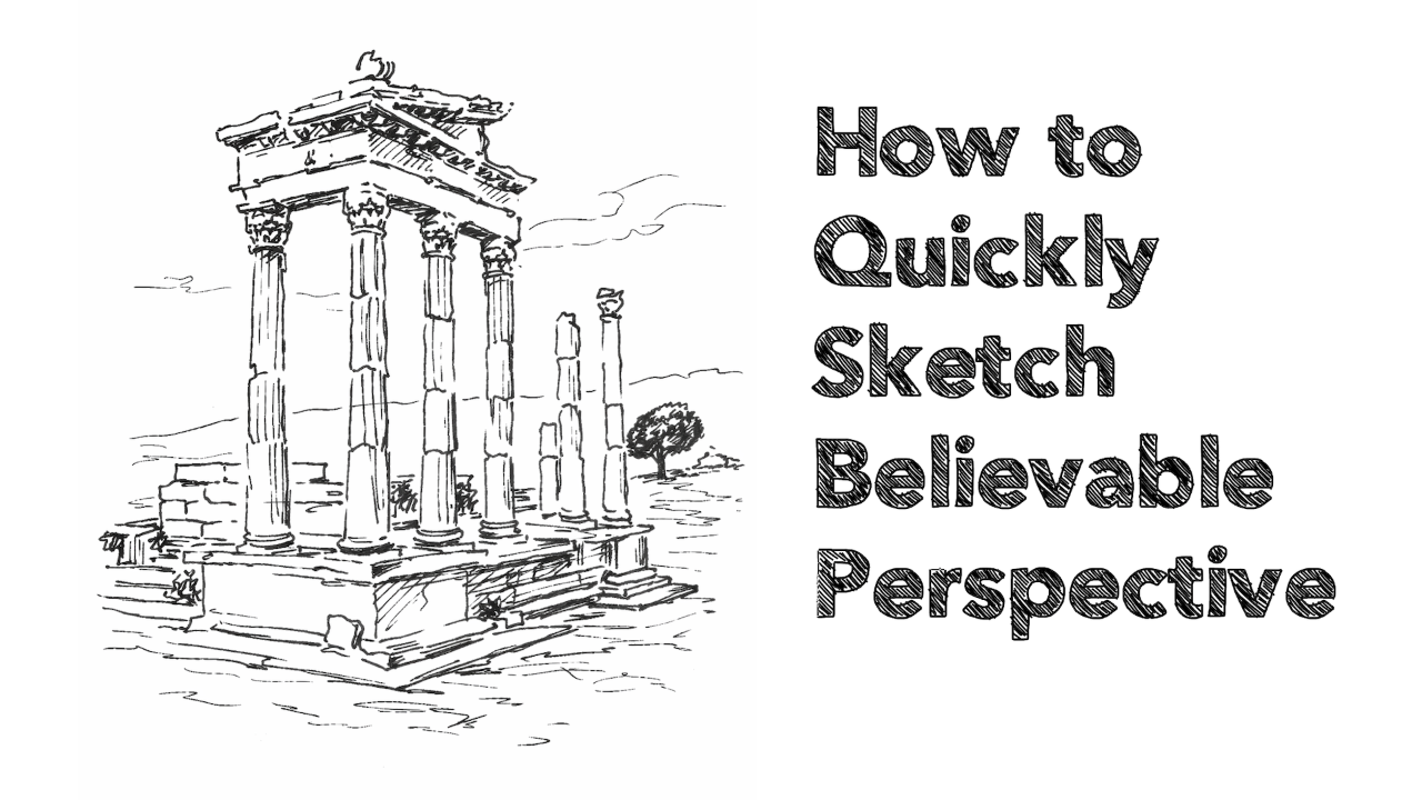
Five Coloured Pencil Techniques That Will Improve Your Next Drawing
I'd like to share with you five techniques and tips that form the backbone of my approach to drawing with coloured pencils.
I think drawing with coloured pencils is often made far more complicated than it needs to be. Especially for newcomers!
I've seen artists making dozens of complex colour charts with every possible combination of their 120 pencils. I see them stress over blending - painstakingly building as many as 10 layers trying to achieve the perfect colour match. And I know artists that spend upwards of 50 hours on each drawing because, well "that's how long coloured pencil art takes".
But I love coloured pencils for their simplicity! No other medium is as fuss-free and as mess-free.
I like to work quickly and I like to keep materials to a minimum. I also focus on a very small number of techniques that make the greatest difference to any coloured pencil drawing.
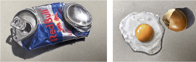
The images below are all based upon these five techniques. Because I have to film most of my artwork for video lessons, I don't have the luxury of spending 10 or 20 hours on a coloured pencil drawing as many artists do. Most take me between one and a half and three hours. This soda can is the exception and took me a little longer...

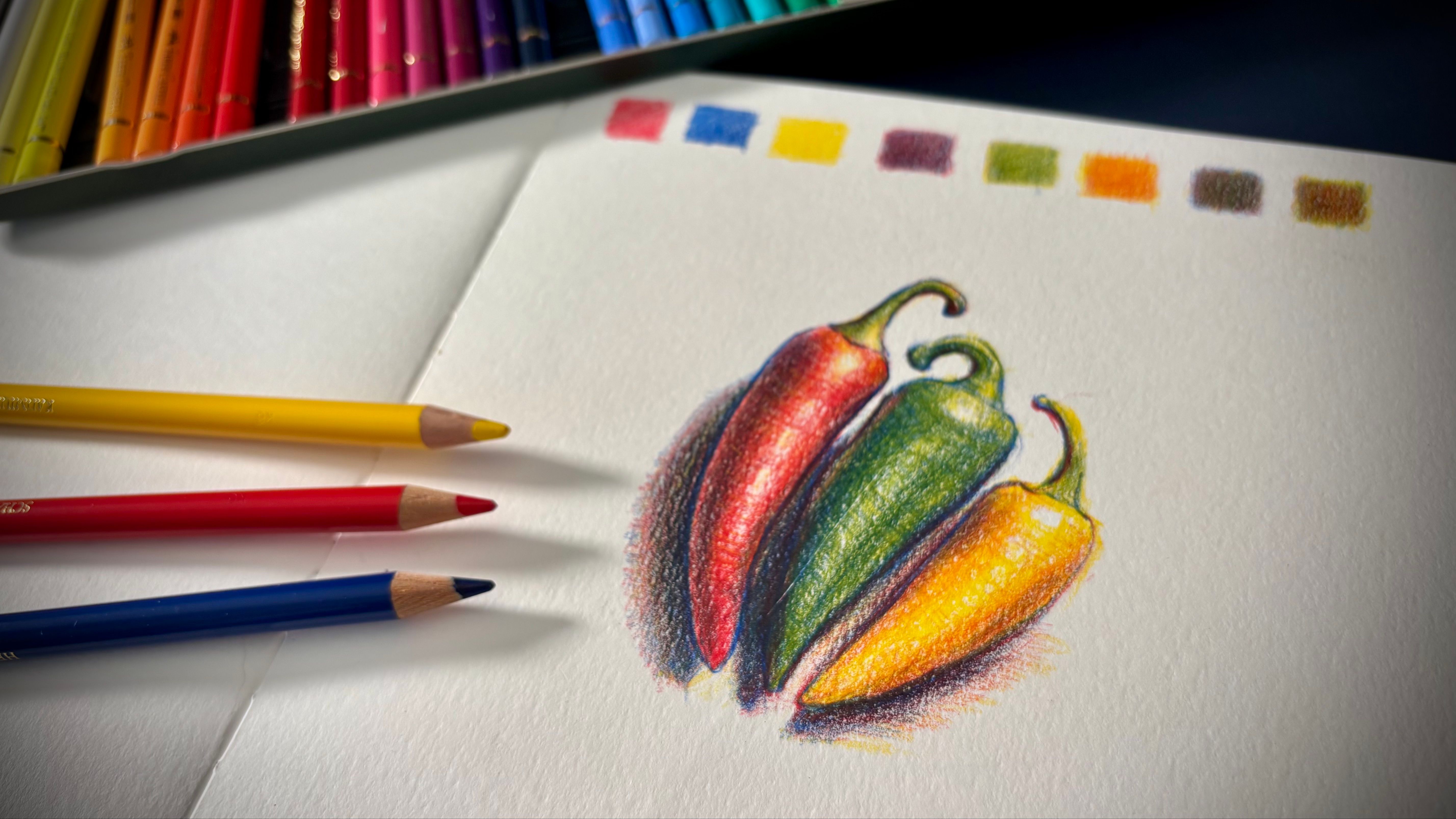
TECHNIQUE #1 - Use a limited set of colours
I've never bought more than a set of 36 pencils and I have yet to come across a subject matter that I can't tackle with that set of 36.
But even then, for any single drawing, I use no more than 8-12 pencils. I have a quick and simple process of selecting those colours ahead of time, and then I close the rest of the tin and put it to one side.
It massively reduces the number of decisions I have to make whilst drawing, which can pull you out of that 'flow' state where you lose yourself in the art-making process.
Here's something you might disagree with at first...
Colour choice is not nearly as important as you think.
Value (the lights and darks), on the other hand, is more important than you probably give credit for.
Choose the 'wrong' colours but get the values right and you'll create an excellent piece of art with punch and pizazz. Choose a nice-looking colour palette but fail to observe the values... and the result will be flat and lacklustre!
By the way, I do have a preferred brand of coloured pencils but it doesn't matter which brand you choose - Prismacolor, Faber-Castell, Derwent, Lyra, Caran d'Ache etc. As long as you're not using childrens' pencil crayons, you're good to go with these techniques!
TECHNIQUE #2 - Use toned paper
Most people automatically reach for pure white paper. That's what we're taught to use at school. After all, a white undertone allows for the most brilliant and vibrant hues.
But working on white is more difficult than working on a mid-tone like grey or tan.
The reason goes back to values: with a pure white paper, you're judging everything against one extreme end of the value scale. With a mid-grey you can more easily judge lights and darks because you're comparing to the middle of the value scale.
This might not sound like a big deal but it is.
Having worked with and seen the artwork of hundreds of students, I think every newcomer and struggling artist can really benefit from working on toned paper.
Don't worry about your colours looking flat. I wouldn't say the sneakers below are dull. Unless you're using pencil crayons made for school kids that are all binder and no pigment, you'll cover a mid-tone paper surface just fine.
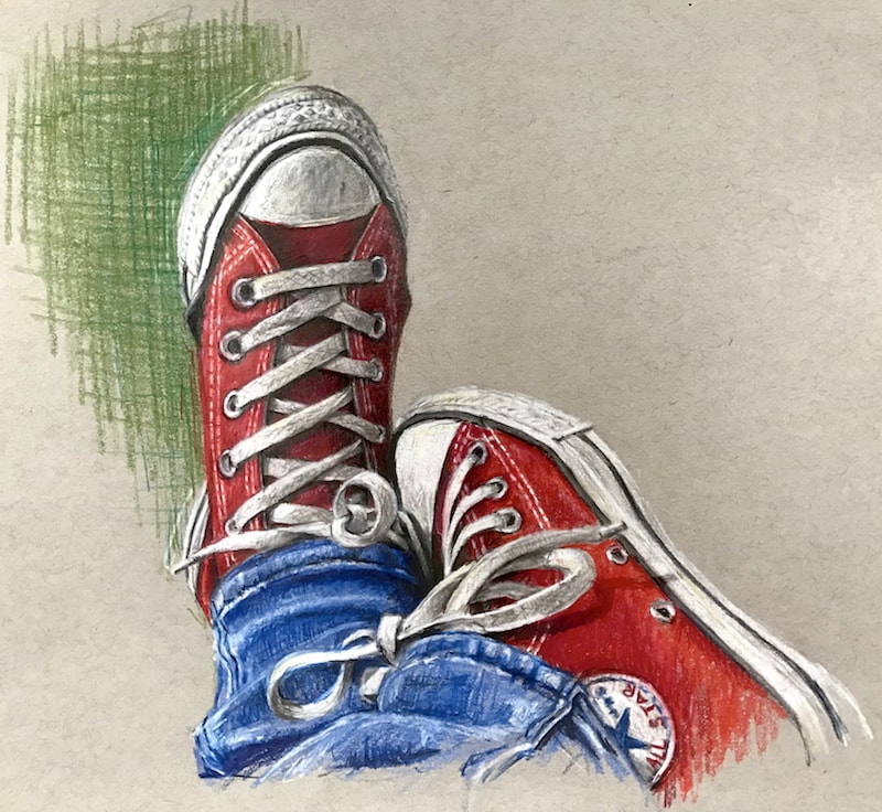
Toned paper won't stop you from achieving vibrant colours.
TECHNIQUE #3 - Don't stress over blending and burnishing
"Blending techniques" is one of the most looked up search terms on Google related to coloured pencils. I think it's because, being a dry medium, it's not as obvious as blending say, two watercolour pigments together.
But if you get technique number 4 right (up next), blending will take care of itself!
A burnisher or colourless blender will smooth things out a bit but they can't suddenly transform muddy colours into vibrant ones, or rough and ready textures into polished ones.
As for solvents, I strongly advise you leave them to one side for now. I have nothing against them at all but if you're struggling to make the kind of artwork you're happy about, solvents aren't going to fix that. All they do is add an additional layer of complexity that will hinder, not help you.
I didn't use any solvents in the images above. I used a burnisher on the fried egg and soda can. It made a small difference that was only noticeable to most people when the before and after was placed side-by-side.
I used a colourless blender on these two images but no solvents.
TECHNIQUE #4 - Master layering
Layering, not blending, is the number one technique you need to focus on.
You probably already know that you typically (but not always) layer from light to dark with coloured pencils. But there's something more important than that...
Pressure!
Understanding the pressure you use with your pencils, depending on how many layers you think you need for a certain area, and what layer you're working on (i.e. the first or the last), is the number one key to great coloured pencil art.
Most instructors I've seen use the same light pressure for every layer (and they build up lots of layers!). Yes, if you're aiming for hyper-realism then that's the level you need to commit to. Otherwise, it's a really inefficient use of your time!
Very often I'll use just a couple of layers in certain areas of a drawing. The most I'll use anywhere is maybe four or five.
Again, I'm not concerned with a perfect colour match - which might need dozens of layers with very light pressure. I care far more about the values - the lights and darks - and they can be achieved with a lot less work than you think.
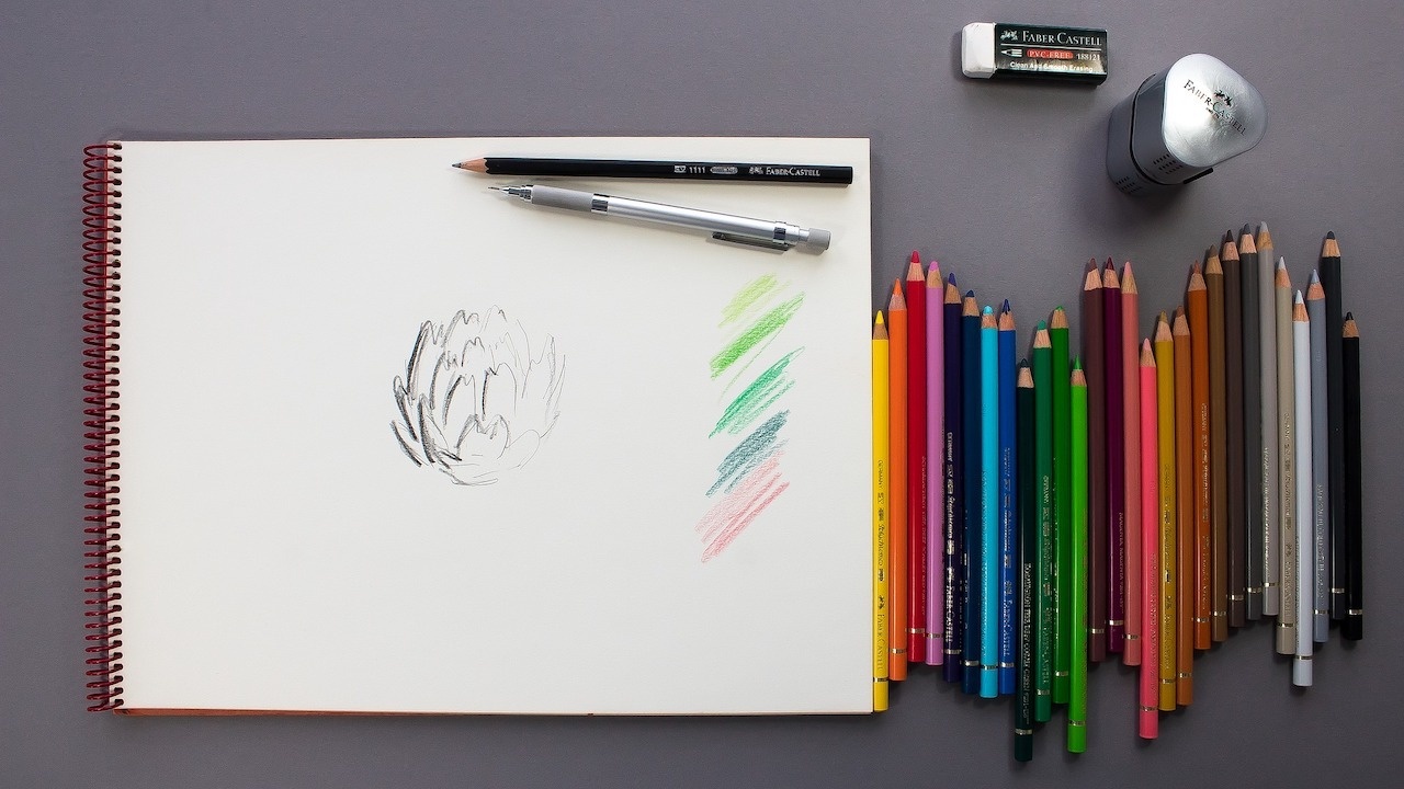
TECHNIQUE #5 - 10-15 minutes of prep
Before every piece of art I make, I spend five minutes selecting a limited set of colours. I test these out on a spare piece of paper or to the side of my drawing paper.
I also look over the reference material and pick out areas and objects that might cause me an issue or that I'm just not sure how I'll approach.
The last thing I want to do is go in 'blind' and experiment on my actual drawing. It's amazing how just a few minutes laying down some colours and textures to see the effect you can achieve, dramatically speeds up your actual drawing.
It also gives you the confidence to be bold and quick.
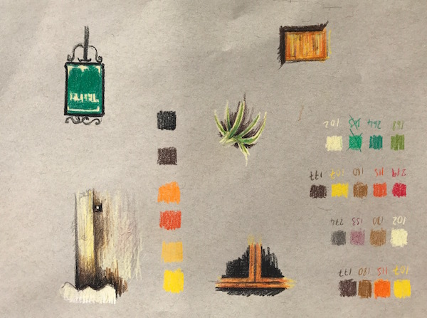
My prep sheet for the Italian cafe image.
These 5 Techniques in a step-by-step method
The pear study below is from my free video lesson Getting Started Right with Coloured Pencils...
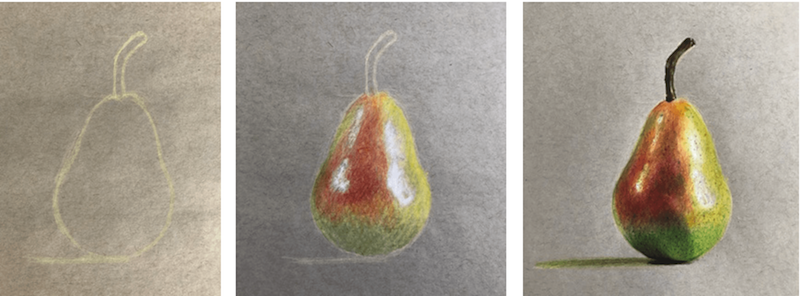
It takes you through each of the five techniques above - both in video format and through step-by-step illustrations - in the detail you need to master coloured pencils quickly.
I've also created a free accompanying ebook (that you can read in less than hour) that guides you through my coloured pencils method.
If you'd like to make fantastic coloured pencil art, and you like the idea of a simple, enjoyable process that dramatically speeds up the learning curve, then why not take a look?
Never Miss a Blog Post!
I'll send you a short email whenever I publish a new blog post (which is most weeks)...
I will never send you spam or pass tyour email address to any third party