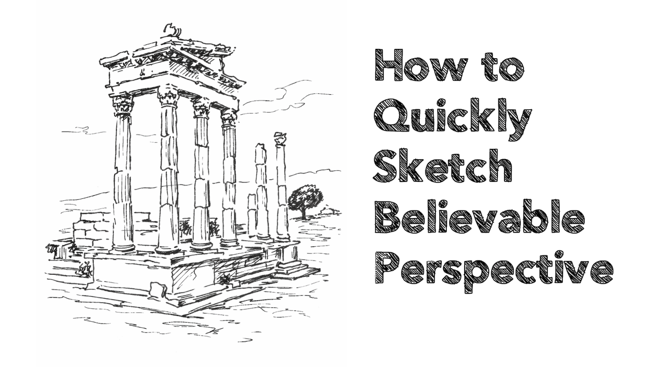
A Guide to Pastel Papers
Surface choices in most mediums are so varied nowadays that it can become a bit overwhelming. Pastel papers and surfaces are no exception!
Fortunately, we can simplify things a lot by looking at the main categories and skimming over the more obscure or expensive that I wouldn’t recommend for beginners.
So this is article isn't going to cover every possible type of paper or surface. Instead, it will give you some basic information and recommendations to get you started quickly, without you having to trawl through dozens of manufacturers' websites.
Surface Texture
Papers and surfaces that are suitable for pastels paintings all have one thing in common… they have plenty of texture or ‘tooth’. A paper’s tooth refers to the little peaks and valleys in its surface. It will feel rough and uneven to the touch.
The opposite of this is a very smooth and flat surface, like printer paper or hot-pressed drawing paper. If you try to apply pastel to a smooth surface, you’ll find that very little colour leaves the pastel stick, and any that does tends to look very weak and insipid.
There are various types of textures available in pastel papers and most fit into one of the categories below:
Texture #1 - Ingres or Laid Surfaces
Ingres or laid paper has a very distinctive gridline pattern embossed into the surface. You’ve probably seen it before without being aware of its name and the feel of the texture is quite subtle. Ingres is a type of paper and not a brand name.
A lot of the well-known art brands do their version of an Ingres paper and it tends to be quite affordable. Ingres surfaces won’t take a lot of layering because the texture is only minimal. The upside of this is that you can move the pastel around and blend quite easily.
Because of the uniform pattern and the relatively large gaps between the peaks and troughs, it can be more difficult to achieve sharp detail and you have to work quite hard to cover the pattern if you don’t want it showing through.
I created the above images on an Ingres paper with pastel pencils:-
Pros
- Affordable
- Easy to blend
Cons
- Won't take a lot of layers
- You might not like the gridline pattern showing through
Brands to look out for
- Fabriano Ingres
- Clairefontaine Ingres
- Daler-Rowney Ingres
- Hahnemuhle Ingres
Texture #2 - Honeycomb or Dimpled Surfaces
These types of papers are similar to Ingres in that they have a slight texture embossed into their surface. The pattern looks more honeycombed or pitted compared to Ingres however.
Honeycomb textured papers tend to be a bit pricier than Ingres but still relatively affordable. Layering and blending ability tends to be about the same as Ingres (limited layering, easy blending).
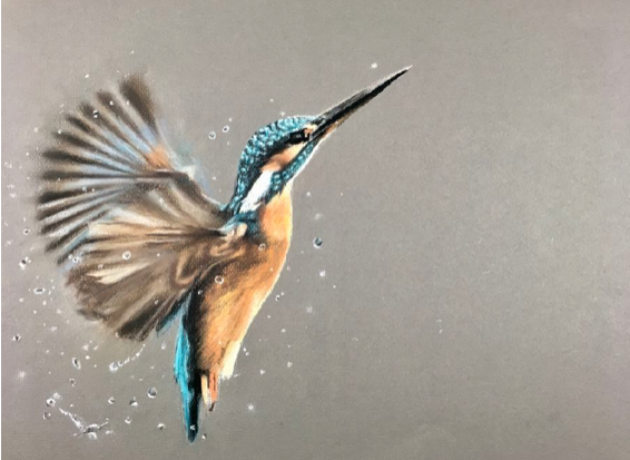
The image below of a Kingfisher was completed on this type of paper:-
Pros
- Affordable
- Easy to blend
- Often has a more subtle texture on the reverse
Cons
- Won't take a lot of layers
- You might not like the honeycomb pattern showing through
Brands to look out for
- Canson Mi-Teintes (not Canson Mi-Teintes Touch though)
- Fabriano Tiziano
- Daler-Rowney Murano
- Strathmore pastel paper
Texture #3 - Gritty Surfaces
Gritty surfaces have a slight sandpaper-like feel to them, though not as harsh. They grip onto the pastel extremely well, and even after you’ve applied several layers of intense colour, they will still allow you to add a bright white highlight on top.
Because of their gritty nature, it tends to be a bit more difficult to move the pastel around but you can still blend beautifully with them and achieve much subtler blends. Gritty papers are pricey and you should only use them for more serious pieces of art.
Keep in mind that if you’re going to start off just using pastel pencils, then gritty papers will reduce their lifespan significantly!
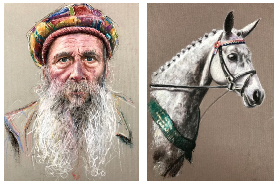
I created the image below on Clairefontaine’s Pastelmat. Compare it to the image of the older gentleman above, which I kept looser to work better with the Canson Mi-Teintes:-

Pros
- Fantastic layering ability
- Allow for very subtle blends
- Great for sharp detail
Cons
- Expensive
- Will use up your pastels more quickly (especially pastel pencils)
Brands to look out for
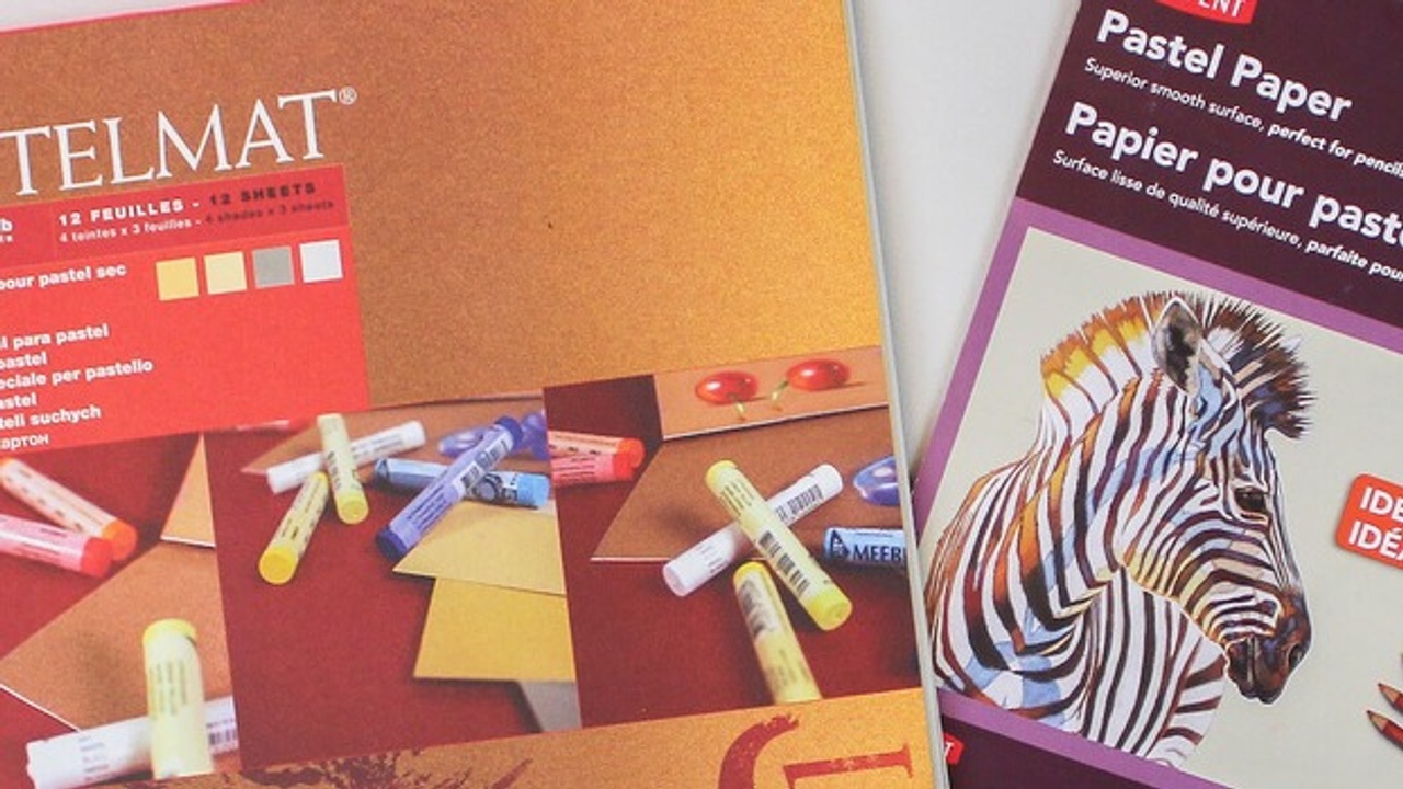
- Clairefontaine Pastelmat
- Canson Mi-Teitnes Touch
- Art Spectrum Colorfix
- Sennelier Pastel Card
Texture #4 - Velour Surfaces
Velour surfaces have a velvety, material-like feel to them. At first, you wonder how well the pastel will grip on to it, but it does. I’ll keep this bit short… velour surfaces are expensive and I only recommend you experiment with them later on.
They take quite a bit of getting used to and you will find the other surfaces above, much more intuitive, to begin with.
Surface Colour
Good quality pastels will completely cover even the darkest coloured papers. That means you don't have to stick to white or off-white as you do with, say, watercolour!
There are no right and wrong colours. Each will give a subtly different feel to your painting and they can act as a more interesting background than plain white (assuming you’re painting something isolated like a portrait or animal for example).
I like to buy pads of various colours and I usually work on a different colour for each painting. Sometimes I’ll pick a colour at random, other times I’ll choose a colour because I think it will look good in the background.
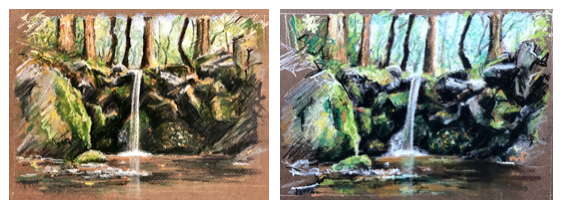
I completed these waterfall sketches on two different colours - one on an orange-brown and one on an earthy brown. They have a different look to them (despite me using exactly the same 8 pastel pencils) but I don’t have a preference for one over the other:
Which Surface For You?
I recommend you start with either an Ingres surface or a honeycomb dimpled surface because of its affordability. My personal favourite is Canson Mi-Teintes.
What I love about this paper is that it works well with soft pastels, hard pastels and pastel pencils. It’s reversible with a more subtle texture on one side and it’s relatively affordable.
Canson makes a series of pads in different colour ranges, such as earth tones and grey tones. Don’t fret over which colour to go with, just choose whatever appeals.
Of course, any of the Ingres or honeycomb papers will work equally as well, so do a search for the brands above and go with anything that looks like it’s on offer.
Start with a pad. As you progress, and especially if you get a set of soft pastels, you might want to work larger than a pad can accommodate. You can buy loose sheets of most of the above brands.
If and when you fall in love with pastels, treat yourself to a gritty paper. Clairefontaine’s Pastelmat is my favourite and despite it being fairly pricey you won’t be disappointed!
Never Miss a Blog Post!
I'll send you a short email whenever I publish a new blog post (which is most weeks)...
I will never send you spam or pass tyour email address to any third party